Master the Self Studio · Life and lifestyle coaching, Tucson, Arizona
Everything you can see was made from one document.
Master the Self Studio came to us as an idea and a written vision. No logo, no colours, no site. We built the brand, then the platform the studio runs itself.
By Robert KociembaUpdated 5 min read
mastertheself.online
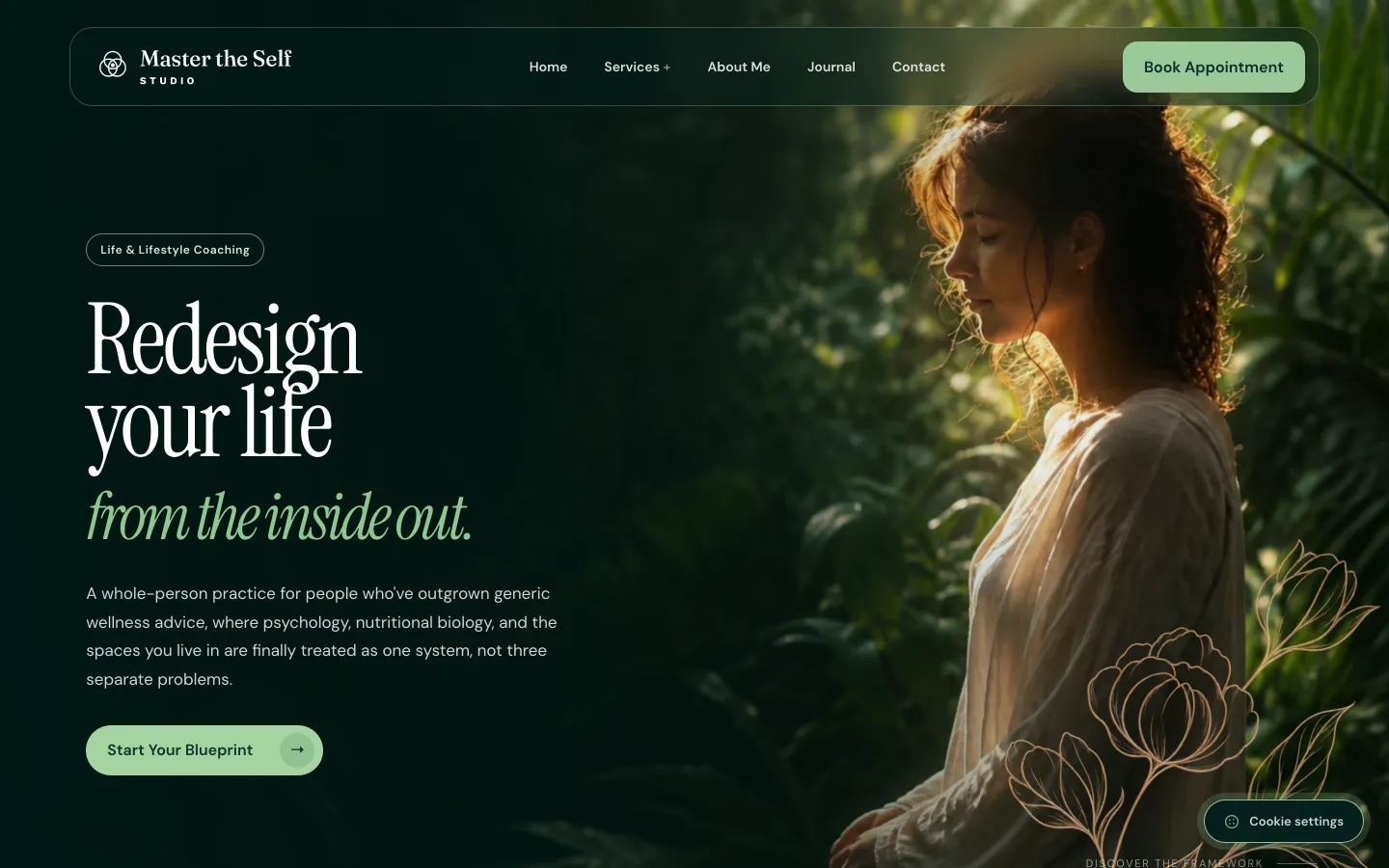
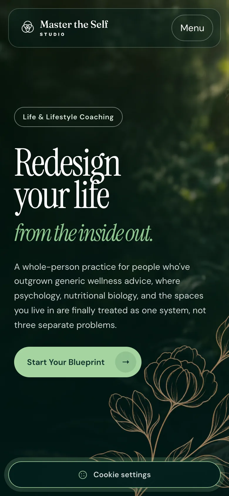
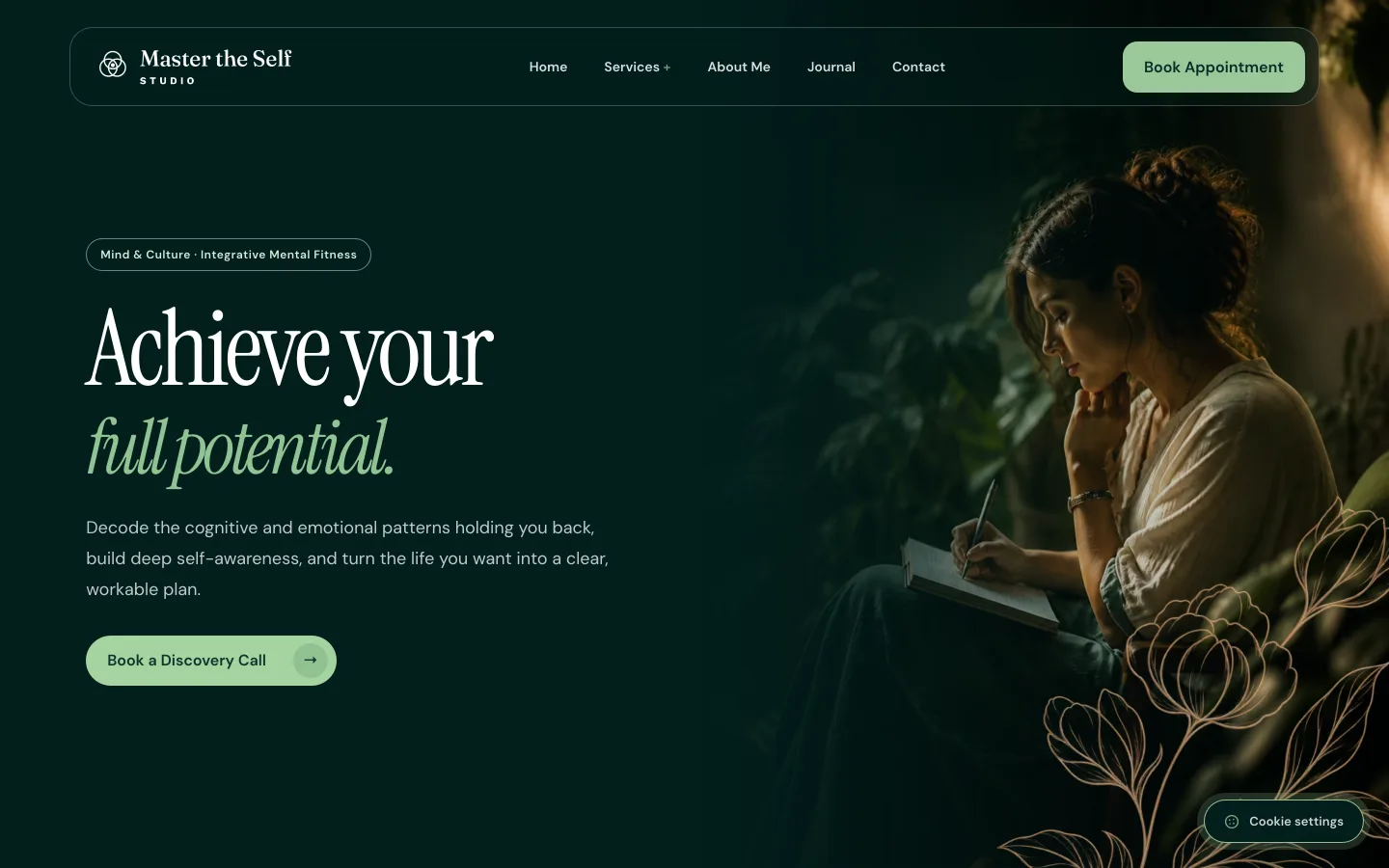
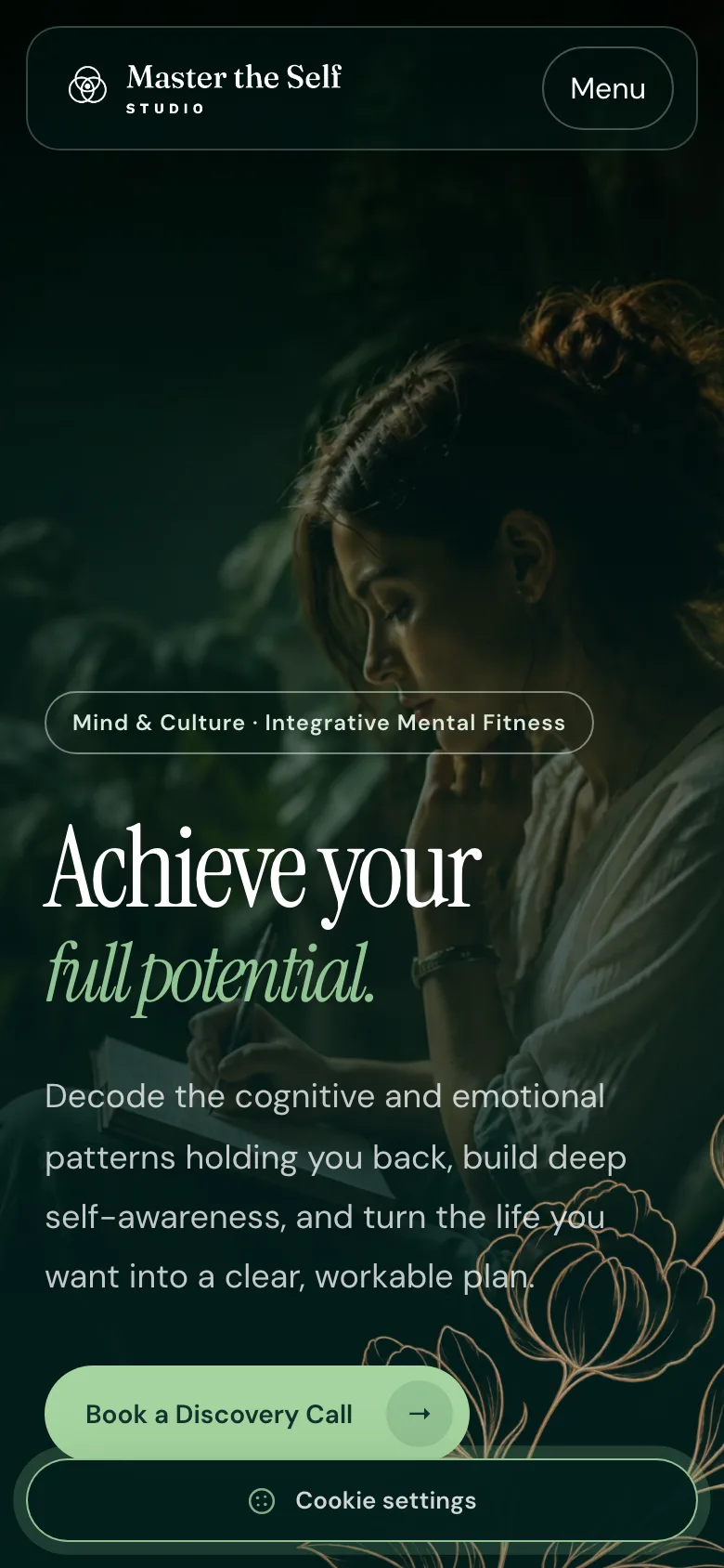
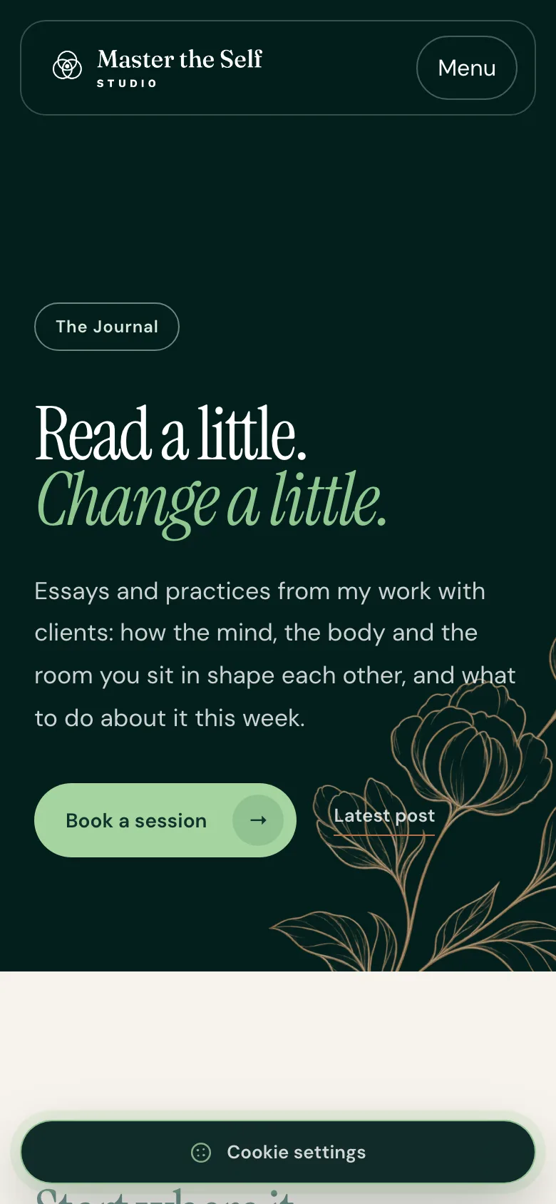
The public site as it runs today, on a desktop and on a phone.
Starting point
One written document, no visible form.
What we built
The brand, a prerendered site and a publishing panel.
The logo is three circles. They overlap, and where all three meet there is one copper dot.
That mark is the whole practice in one drawing, and it did not exist until we drew it. Neither did the colours, the typography, the stationery, the site, or the panel the studio publishes from today. What existed was a document.
Where it started
Jordynn Watson runs a life and lifestyle coaching practice in Tucson, Arizona. She has a bachelor's and a master's in psychology from Arizona State, and a way of working that refuses to treat a person as three separate problems: mind and culture, body and biology, space and environment. One framework, three doors into it.
What she brought was that thinking, written down. A long document covering her background, her mission, the three services with the hook and the scope of each, and a carefully worded note that she coaches and does not diagnose. It was clear, it was hers, and it was thorough.
It was also invisible. No logo, no palette, no typeface, no wordmark, nothing to put on an email signature, no site. A practice that good deserved better than a text file, and until someone drew it, a text file is what it was.
Building the brand first
The mark came out of her own framework rather than out of a mood board. Three circles for the three areas she works across, overlapping instead of sitting side by side, because her whole argument is that they are one system. The copper dot sits at the single point where all three intersect. That point is the person.
Three circles for three areas of one life. The copper point is where they meet.
Around it went a palette that had to feel grounded rather than clinical: a deep green (#1F3226), a copper accent (#BD7C52), and a warm cream (#F1ECE0) to sit them on. The wordmark is a serif with some weight and warmth to it, with STUDIO letterspaced underneath in copper.
Then the unglamorous half, which is what makes a brand usable rather than pretty: horizontal and stacked lockups, primary and reversed versions of each, the mark on its own in colour, black and white, written guidelines so the rules survive without me in the room, stationery and collateral, and email templates.
Forest#1F3226
Copper#BD7C52
Warm cream#F1ECE0
The wordmark and the palette, as delivered.
Only after all that did we talk about a website.
Finding the right way to build it
Her vision then had to become pages, and the first version went up as hand-built static HTML: home, the three services, an FAQ, individual programme pages.
We tried more than one route to the thing behind it. A small content system written from scratch in PHP. A WordPress build. Each is a reasonable answer to a real question, and the question underneath all of them was the same: who is going to change this site in a year?
A coaching practice writes. Journal entries, page edits, a photograph swapped when a season changes. If every one of those needs an email to me, two things happen. The site slowly goes stale, and I become a bottleneck inside someone else's business.
Who is going to change this site in a year?
01Hand-built static HTML
The first version: home, three services, an FAQ, programme pages. Fast, and every change went through me.
02A small content system in PHP
Written from scratch. It answered the editing question at the price of a second codebase to keep alive.
03WordPress
Flexible, with a plugin stack neither of us wrote and a maintenance bill without an end.
04A React site with its own panel
A public site built for speed, and a panel built around one person's work.
What we built
That is what settled it, rather than any argument about which platform is best in the abstract. WordPress would have meant a plugin stack neither of us wrote and a maintenance bill without an end. What we landed on is a site built for speed and a panel built for her.
What runs now
The public site is React, prerendered to static HTML and hydrated in the browser, so a crawler and a person on a slow phone both get the content without waiting for JavaScript. Six pages, a journal with topic pages and pagination, a privacy policy, a cookie panel that sets nothing beyond the necessary category.
mastertheself.online/mind-culture
01Home
02Service page
03Journal
Real screens from September 2026: one service page on a desktop, three pages on a phone.
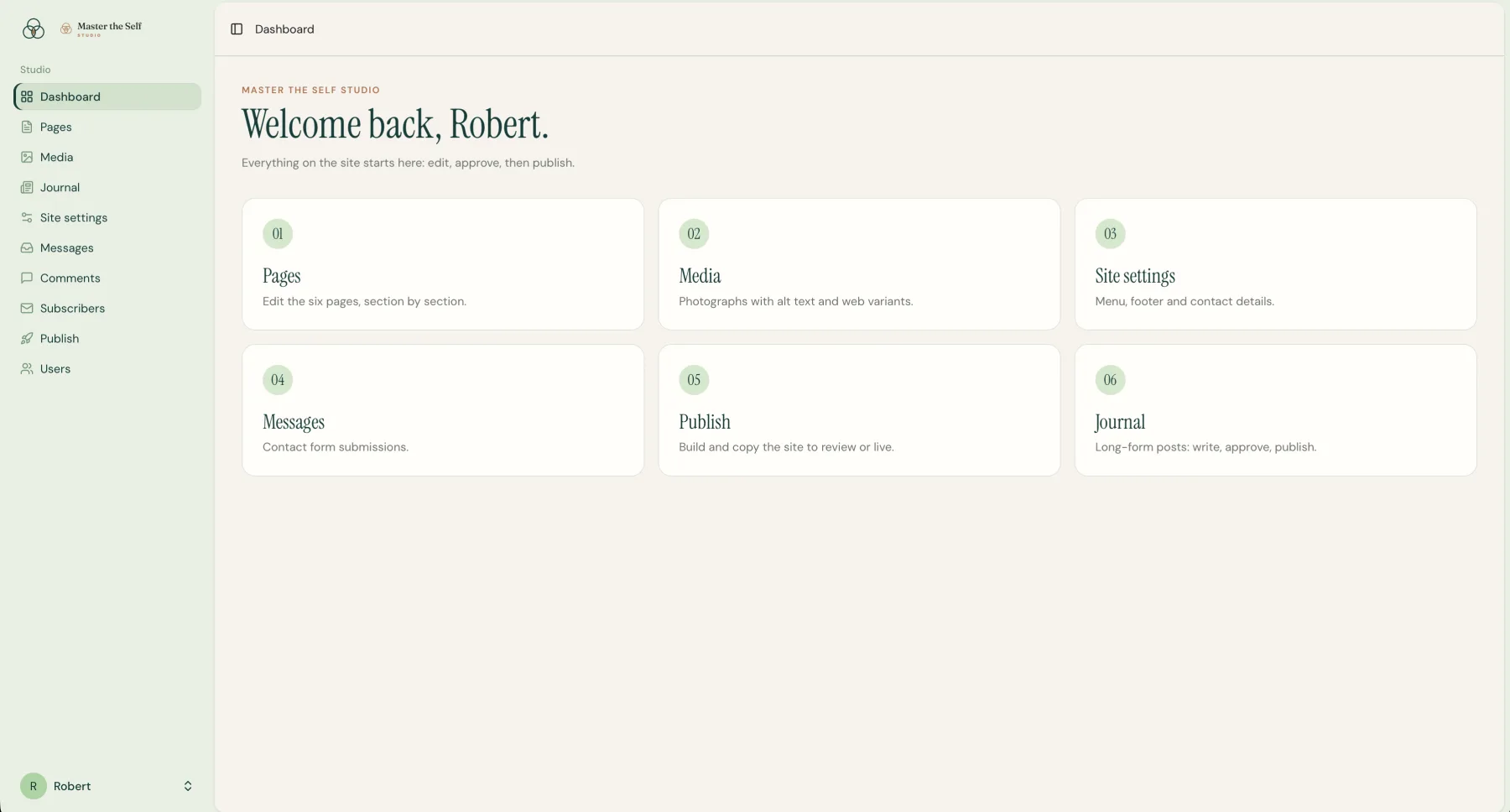
Behind it sits the panel: dashboard, pages, media, journal, site settings, messages, comments, subscribers, publish, users. Editing is done against a live preview where clicking a piece of text jumps to the field that controls it. Save a draft, approve it, publish, and the site rebuilds in a minute or two.
Studio panel · dashboard
The dashboard the owner logs into. Every area is named in the language of the practice, and nothing here needs a developer.
From draft to public
Save, approve, publish. The site rebuilds itself.
01OwnerWrites and reviews
02PanelPages, journal, media
03ApprovalA draft before anything goes live
04RebuildStatic HTML in a minute or two
05Public siteFast and indexable
01
Journal with scheduled publishing
A post dated in the future stays off the site until an hourly job releases it.
02
Comments, moderated first
Nothing appears until it is approved, the owner's replies are marked as hers, and comments can be switched off per post.
03
A subscriber list
Sign-ups from the journal and from under each post, exportable at any time.
04
Backups every night
Kept for two weeks.
The site went public and indexable on 5 September 2026 at mastertheself.online, with the sitemap submitted to Search Console the same day.
In preparation
A dedicated booking system connected to Microsoft 365, so appointments land in a real calendar rather than in a form, and a payments module so a client can pay for the session at the moment of booking it.
Why this one is worth reading
Two things transfer from this project to almost any practice starting from nothing.
The first is the order of the work. The brand came before the website, and the website came before the question of which platform. Doing it the other way round means choosing a system before you know what it has to carry, and then quietly designing to fit whatever that system finds easy.
The second is about who holds the keys. A site the owner cannot change is a site that stops being true about six months after launch. Handing over a publishing panel costs more to build than not handing one over. That is the difference between a website and something the business actually runs.
What changed
One identity. One system the owner controls.
01A coherent identity
Mark, palette, site and panel speak the same language.
02Independent publishing
Pages, journal entries and comments change without an email to us.
03Room to grow
Booking and payments can be added without rebuilding the public site.
Mark van den Hurk started with an idea for his own DJ website, one conversation and a few photographs. Those inputs became the DJ Marcos identity and a bilingual site built around the evening he wanted to set.
SEMA builds fitted furniture in Szczecin. I have rebuilt its website several times over the years, written every word on it, and this time built the panel behind it too.